The Psychology of UI: Why Frictionless Design is Essential for High-Stakes Applications
Last Updated on 2 November 2026
Users Decide in the First Minute
People have very little patience for new apps. Most fresh installs are abandoned within a month, and product teams know they have about a minute to show a new user why the app is worth keeping. There’s no longer any room for clumsy onboarding.
Speed matters just as much. Google’s research found that as mobile page load time goes from one second to ten, the chance of a visitor bouncing rises by 123%. Slow, clunky software also costs companies internally, in staff time spent waiting on screens and in support tickets from confused users. Read the public reviews for any big platform and you’ll notice that people rarely ask for new features. They complain when a menu freezes or a form loses their data. Removing those small points of friction is one of the best investments a product team can make.
Why the Brain Avoids Effort
Conversion ultimately comes down to how the human brain spends energy. The brain runs on a tight energy budget, which is why even a small visual stutter can cost a sale. Daniel Kahneman’s research describes two modes of thinking: a fast, automatic mode and a slow, deliberate one. People prefer the fast mode because it takes less effort. A confusing screen forces them out of it and into deliberate, tiring analysis. That happens the moment someone has to decode an unexpected pop-up or hunt for a payment link. Make people stop and puzzle things out, and many of them simply leave.
BJ Fogg’s behavior model makes a similar point. A behavior happens when motivation, ability and a prompt come together at the same moment. Friction reduces ability, and enthusiasm rarely survives a hostile interface. Picture a shopper stuck in a password-reset loop on a site that keeps crashing. At some point they give up, not because they stopped wanting the product but because the effort became too high.
Borrowing a Workload Test from NASA
To measure this kind of mental strain, UX researchers often use the NASA Task Load Index, a questionnaire originally developed to assess workload in aviation and spaceflight. It scores tasks on several dimensions, including mental demand, physical demand, time pressure and frustration, which helps pinpoint where a layout overloads people. A high mental-demand score usually points to a confusing information hierarchy. A high physical-demand score often means the buttons are too small and users are stretching their thumbs to reach them.
Frustration tends to peak when a system asks people to remember details across several disconnected screens. Mobile use happens in short, interrupted bursts: a phone call comes in, a child needs attention, and the session gets dropped. Good apps protect that context. Keeping text that’s already been typed and saving the cart are basic requirements, and wiping someone’s progress after they briefly switch apps is a quick way to get uninstalled.
The 400-Millisecond Rule
Much of that fatigue starts with slow responses. The Doherty Threshold, which came out of IBM research in the early 1980s, holds that productivity rises sharply when a computer responds in under 400 milliseconds, because neither the person nor the machine is left waiting. Go past that limit with a slow database query and the user’s attention starts to drift.
Slow software erodes trust quickly, and mobile hardware adds its own problems. Fitts’s Law says the time it takes to hit a target depends on its distance and size, so a tiny ‘Confirm’ button in the top corner of a large phone screen is hard to reach with one thumb. Hick’s Law adds that the more choices you show, the longer people take to decide, so twenty options on one dashboard slows everyone down. Good layouts use progressive disclosure, keeping advanced options in collapsible menus until the user needs them.
Identity Checks and the Password Problem
Legal compliance makes this balance much harder. Security checks are often the biggest source of friction in digital products, and fintech apps lose a large share of new sign-ups during identity verification. Blurry document scans, camera readers that won’t focus and long questionnaires all push people away before they ever see what the product does.
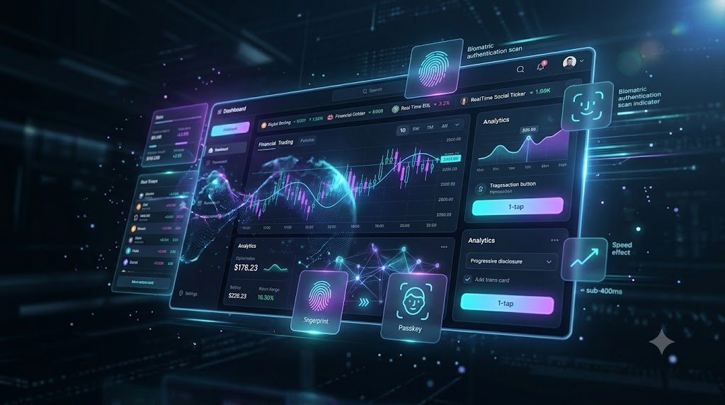
Progressive profiling helps. Instead of asking for everything up front, the app lets a new user explore a limited version with just an email address, and asks for a passport or biometric scan only when they try to do something that legally requires it, such as moving larger sums of money. Replacing passwords helps even more. Passkeys built on the FIDO2 standard let people sign in with a fingerprint or face scan in a couple of seconds, and they remove password resets altogether. For a busy online store, fewer resets means fewer abandoned sessions and more completed orders.
Working Around Regulatory Friction
Europe shows the tension clearly. Under the EU’s Strong Customer Authentication rules, many online payments must be confirmed with two independent factors. Each extra check pulls the shopper out of a relaxed state and into a more analytical one, and cart abandonment goes up.
The better payment providers reduce this friction by using the exemptions the rules allow for low-risk transactions. They pass extra context about the device and the transaction to the issuing bank in the background, so many payments can be approved without an extra step. Some companies are also building a “digital twin of the customer,” a real-time model of how a user is behaving. If the system sees signs of frustration, such as repeated taps or failed password attempts, it can adjust the flow, for example by offering an easier sign-in option, within whatever the security rules allow. The aim is software that adapts to the person rather than the other way around.
Lessons from Online Casinos
Some of the best examples of low-friction design come from outside traditional e-commerce. Regulated online casino apps handle real-money transactions and identity checks while keeping the experience smooth for the player.
These apps have very large game libraries, so they rely on horizontal carousels and clear visual grouping to keep things manageable. Social proof, such as recent wins or live jackpot totals, runs alongside the main content without getting in the way. The back end has to stay fast under heavy load too, because a delay during a live game quickly makes players lose confidence, and live odds and dealer video streams have to work reliably even on mobile networks. These platforms show that strict regulation doesn’t have to mean a clumsy interface, and retail designers are borrowing many of their ideas.
When Friction Is a Good Thing
Removing all friction isn’t always the right goal. A completely frictionless design assumes people always act carefully and with full attention, and in practice they don’t. Sometimes a designer needs to add a deliberate pause so people stop and think before doing something they can’t undo.
A database administrator who has to type the name of a table before deleting it is dealing with useful friction. That short delay can prevent a very expensive mistake. Bad friction, often called sludge, is the opposite: hiding a cancel-subscription button behind four menus serves the company, not the user. Regulators are paying attention, and both the FTC and European authorities have taken action against dark patterns that make cancelling difficult or rush people into decisions. Every unnecessary second of effort costs money, but the companies that do well will remove pointless friction while keeping the pauses that protect users.